So today (or shall I say yesterday) was thanksgiving. And may I say, it was definitely better and different than last year. I made cinnamon buns, and my family LOVED them. They were a HIT!! :D My aunts and cousins kept asking for the recipe, and my aunt even showed me her recipe cookbook full of desserts and recipes from other people going all the way back to who know's when. Ok well not that long ago. It's 12:57 and my sister and I plan to go black Friday shopping a little later on. We're not much of crazy shoppers so it's all good :) As of now....I'm just so happy and excited for Christmas and New Year's. I'm thinking of making my famous cinnamon rolls, churros dipped in chocolate and bringing hot chocolate (last one is a maybe). Time for reflection of this past year:
I can't believe it's near the end of 2013. I feel like I haven't finished 2012 yet haha. But really, the last few months of 2012 were a revisit from my depressed years during 7th and 8th grade. And now it's towards the last month of 2013 and I still haven't adjusted to seeing the numbers 2-0-1-3 on papers. Occasionally I want to write 2012 but I don't. I don't know, I have a feeling 2014...(ahh writing those numbers feels like time has passed so vastly) will be so so soooo SO much happier, energetic, brighter, oppurtunistic, life changing, (hopefully not too)faster, stronger, and better (like the daft punk song). And OMG I just found the song with the deep drumbeat I "thought" I found all year, it's by Kanye West- Black Skinhead. That's pretty much all I have to say for this year, I'll definitely be adding a more deeper personal post when the time comes for the new year. Oh yeah, I hope and know my fabulosity will stay and thrive through my style, personality, dancing, mind, body (ooooo haha jk), and soul. (Don't you just love that last classic part?)
Until next time,
Romelyn :P
Friday, November 29, 2013
Tuesday, May 28, 2013


Tuesday, May 14, 2013
Lilith & Lomo

Lomo
For this photo, followed the tutorial directions completely. Not much to say, I added a vignette, though it looks quite strange, softened the radial blur, and adjusted the channel mixer, making the red tone more vibrant. The radial blur is concentrated more on the fence area, bringing out diagonal/vertical lines around her. I also added some noise with an amount of 10 to the overall picture and the radial blur filter.

Lilith
I did the same with the lilith as the lomo, basically adding a vignette by creating an oval. I added a layer with a noise filter, and set the amount to 30%. After that came the opacity decrease of the whole layer down to 30% as well. Then I inverted the oval so that I could delete the inner oval and get rid of the black inside to reveal the picture underneath and next changed the filter into a soft light. Finally I painted the inner edge of the oval with a soft black brush to blend the whole lilith vignette more smoothly :D
Thursday, April 25, 2013
Day For Night Exposure
I took pictures of pea plant flowers from the school garden. The first 3 each show the different ISO settings. And the last half shows the different ranges of the light meter on each pic. I didn't really master the 'day for night' exposure, and in the beginning I had the idea planted in my brain, and the concept faded away a little during the practice shots.

This was taken with an ISO of 100.
.JPG)
This was shot with an ISO of 400. I also forgot not to make drastic edits in lightroom for this. So all the colors and the lighting are altered. Oops.....*smh*

This was shot with an ISO of 1000.
Light meter ranges

This was shot with ISO 400 at -2 on the light meter.

This was shot with ISO 400 at -1 on the light meter.

This was shot at ISO 400 at 0 on the light meter.
Flower Power

To make the flower look like its shooting out magic and lights, I used the standard paint tool to add the white dots. A few dots at the base of the flower, and transitioning to a bigger size as it flows out. To give the bokeh effect, I 'spread' the dots by 7-9%. I boosted the opacity to 33%, and made the size around 40%. This was all done using the outer glow in the layer. In the next layer with the strokes, I used the pen tool, then ctrl clicked on one of the lines. I selected the stroke path of a brush, and made sure to simulate the pressure. I used the same steps to create the soft glow around the bokeh, to the wispy strokes. There were pen lines inside the glowing strokes, but when I saved the final overall picture, it got rid of them.
Tuesday, April 16, 2013
Animals
The dogs in these pictures are of my neighbor's dog charlie, and my sister's dog Milo

Scared Charlie
I asked my neighbor real quick if I could take some pictures of her dog. So...this is Charlie. He's a Corgi. Corgis are known to be energetic and obedient, but can be aggressive at times. So here was Charlie, taking a bath after playing outside. He was pretty scared of me, and he hates water as well. SO I thought that this pic was good at capturing his emotion of fear and sorrow. His ears are somewhat folded back, his eyes have a depressing look. I edited this in lightroom and based my changes of a preset of B&W- Look 3. I turned down the blacks a bit, the darkness of the wet fur was seemed a little too distracting.


Tuesday, March 5, 2013
How I Roll
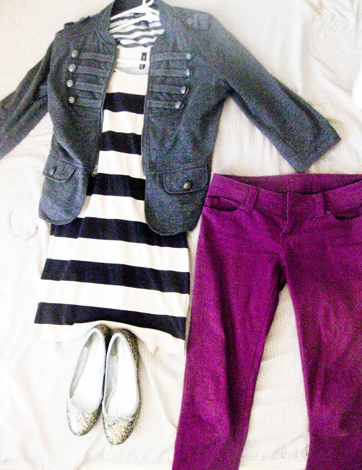
How I roll is through fashion and personal style. Most of my photos have a meaning, inspiration, or sense of confidence.

Music Inspired
The outfit in this photo shows more of a subdued version of music translated into fashion. For some people, it might be hard to tell that the shirt says and has a screen printed pic of The Beatles. I edited this using only lightroom, cropping out the extra space of the tennis fence behind her (Carolina), and played with the whole vintage "filter" look. I gave the overall photo a cooler temperature, deepened the blacks a bit, and added a little bit of the fill light to create the white airy look at the top. Then, I lowered the clarity to about -5 to make the details and outlines of the objects less harsh and modern day HD looking. Finally, to make the main outfit stand out, I amped up the vibrance so that the red shorts and red lips added a little twist. In my mind, the style portrayed in this pic shows the vintage side of me, and how I like to incorporate color and a bit of a modern twist to retro pieces. Also, since The Beatles were a alternative/rock/pop/indie band, it describes how my taste in music has changed, genre wise, from rap to alternative/indie music. (My fav band is Imagine Dragons.)

Fitness
Now besides emphasizing the Nike logo, this pic of my running shoe has quite a motivational meaning to me. My sister Jessica has been getting into healthy fitblrs (fitness tumblr blogs) and is transforming into one those fitness/health lover people. And lately, the Nike lunar running shoes has become a big trend in the workout world. So once she introduced me to them, she got me the lavender + black ones and the bright scarlet ones for herself. Basically what I'm doing in the pic is putting on the shoe before my friend and I played tennis (Carolina took the pic while on self timer). I really didn't make any adjustments, because I love the lighting of the sunset that day. On lightroom I turned up the contrast and deepened the blacks. Then on Photoshop, I dodged the lavender lining and logo of the shoe. "Just Do it" can have many different interpretations, but the way I look at it is that it means 'Just be crazy' 'Just be Wild' 'Just be healthy' and motivates me by pushing myself to "Just Do it."And since most people don't think of health and fashion mixing, it makes a lot of sense to me, because now I can also be fit....with style.

Combat Boots
As big as the trend is, combat boots really are a staple of my wardrobe. Combat boots are universal for both men and women, originating from army soldiers when in combat, and making its way through the runway by accentuating the edginess of the girls' outfits. I only have one pair of combat boots, which have worn out a lot since last year from wearing them almost everyday. The compilation of pics was edited all on photoshop. I lassoed the two combat boots at the top from pics of my friends wearing them. All the three background pics were lowered to an opacity of about 39%. The top pic is a scene from "Captain America: The First Avenger" which all of the men are wearing the boots, then transitioning to the middle to a camouflage pattern to give a little history of what they were typically worn with, then to the bottom pic of Carolina, who is a great example of showing how she styles her boots into a feminine way. To draw attention away from the lines of each separate pic, I blurred the lines slightly. As for the font, I chose a strong utilitarian font on "combat" and cursive, girly, pink font to add a feminine twist to "boots." For me, combat boots gives me a sense of toughness, confidence, and "hey, I may be a girl but I'm stronger than I look" attitude. (Thanks Mrs.K for the Ideas!!)

90's revival
Ok...now I what this pic is awesome for the old school sweater. And as much as I dread this word from exposure to hearing it so much........I must say, it has Swag. The story behind this is that it used to be my oldest sister's (Angelica), and somehow its been saved to this day in Jessica's closet. Whenever Angelica sees it, its like a tacky piece of clothing of her teen years in the 90's. So, she obviously hates it now. But since the come back of 90's clothes, this sweater now obviously fits into the Hipster category. All my alterations were on Lightroom, and I cropped out the distractions of the background (my bag on the side, people hanging out, etc.). I tinted the overall pic with a little bit of a pink tone, turned up the vibrance a lot to show the true colors of the sweater, deepened the blacks a bit, added a slightly warmer temperature, and finally turning up the fill light. Overall this is my favorite photo, not only because of my Hipster 90's sweater and mint green shades making me look like a boss. But because it clearly implies how I like to wear pieces from back in the day and style it into something a little more out there with a modern touch.
And that..is How I roll.
Thursday, February 21, 2013
Texture Layers, Opacity & Blending Modes

I took this picture of my friend Cris by the Gym. I asked her to wear her mint green sweater for my "how I roll" project, and surprisingly, it also worked for my texture layer, opacity & blending modes pic. I remembered I also had a picture of the fence/ mesh fabric cover at the tennis courts, so I used that. The gridlines were similar to the mesh/ crochet detail of Cris' sweater, so that's why I chose it. I increased the vibrance of her sweater and brought up the fill light a little bit. Then in photoshop, I lowered the opacity of the tennis fence to 28%. That was pretty much it for my texture layer picture.
Tuesday, February 19, 2013

Friday, February 8, 2013
Water Drops

For this flower, I made a lot of my edits on Lightroom first. In the original picture, I turned up the color temperature and exposure a bit. Then I amplified the contrast. The whites and blacks are turned up at the same amount. I brought some of the clarity down to make the deadly-ish looking petals more soft and tubular to make it look like a sea plant from a coral reef. In photoshop, I followed the tutorial and made the blues a lot more vivid, the yellows almost as bright and toned down the warmer tones like red and magenta.

Saturday, January 19, 2013
Photo Final
My theme/ subject for my photo final was a silver vintage tarnished teapot set.

Shape
This picture represent shape because of the circles on top of the teapot containers. The light illuminates
the rim around the tops, giving it a circular shape. The set the camera to a shutter speed of about 250 and an aperture of about 5.6. For printing, and aperture of 5.6 for 2 seconds, I also used a filter. Also, the background wasn't completely white, so I had to enlarge the picture and make the teapot set a lot bigger. It was then placed in the developer for about a minute or so, I tweaked the time to prevent from over-processing. I left the pic in the stop bath for 30 sec. regular time, and the fixer for 2 min.

Lines
This picture represents lines in the sense of the light circling around the indents of the plate. I thought the light looked cool on how it didn't perfectly rim around, and how the size of the each lines were slightly different from one another. The only annoying part was the strong white glare in the center, which (if I shot this picture at a better angle) would've shown the texture of the intricate design of the plate. I shot this with a shutter speed of about 500/1000 and an aperture of about f4, f/2. Then, I printed this picture with an aperture of about 3.5 for 2 seconds. The plate was already shot at a close enough angle, so I didn't enlarge it. As for all the photos, I left this pic in the developer, stop bath, and fixer for all the same times; 1 min. (tweaked), 30. sec., and 2 min.

Form
This photo represents form because of the deep shadows and highlights of the sugar pot ( I think it's a sugar pot, idk I'm not an expert at tea sets :P). The grayish cast softens the shadows of the sugar pot, making less harsh on the eye. I shot this picture with a shutter speed of about 250, and aperture f/4. Finally I printed it with an aperture of 5.6 for 2 sec. with no filter. I didn't enlarge this photo too much, only because originally I thought it would work for space, but "space" is a completely different element.As for all the photos, I left this pic in the developer, stop bath, and fixer for all the same times; 1 min. (tweaked), 30. sec., and 2 min.

Texture
This photograph represents texture because of the detailed carvings/ imprints on the spout and legs of the teapot. When I shot this, the camera didn't really capture the tarnished parts on the imprints. After printing though, I realized this also worked for form because of the shadows and highlights. I shot this picture with a shutter speed of 500 and aperture f/8. As for printing, an aperture of 5.6 for 2 sec. with a filter. I also enlarged the photo so that the majority of the picture, had the teapot as the focus. As for all the photos, I left this pic in the developer, stop bath, and fixer for all the same times; 1 min. (tweaked), 30. sec., and 2 min.
Subscribe to:
Comments (Atom)